With only the product and the idea existing, our task was to create an expressing brand, packaging and website design.
The client wanted a clean, minimalist branding that puts the focus on the product and its benefits. With this in mind we selected a light and nature inspired colour palette that complements the rich botanical ingredients that are used in the soap-making process. For typography, we picked a sans serif font called Josefin Sans, which brings the brand to life.
The target & challange
Get rid of ingredients we don't actually need
BLOOMY intended to offer a pure solution for those who are looking for a safe, chemical-free, and eco-friendly option by stripping down the unnecessary ingredients and infusing the products with natural components. Based on our market and competitor analysis there are plenty of artisan products on the market but most of them are still struggling to get visibility over large enterprises.
The biggest challenge we were facing was to create a voice that is loud enough to shout about the high variety of unique products and to make a solid presence in the artisan skincare market.
User research
Finding the target audience
As part of the research process, we identified BLOOMY’s target group and created a loose persona named Lara, to represent that group.
Lara is health-conscious and concerned about the toxic ingredients and chemicals that she is forced to use through many of her favourite skincare products. Therefore Lara is always on the hunt for healthy alternatives that are not only free of any harmful chemicals but do their job right and feel nice to her skin.
Her main frustration comes from how hard it is to find the right products and use them in the long term, as it seems independent entrepreneurs keep popping up and disappearing in the market. Lara would like to find a solid company that she can trust and satisfies all her beauty needs.
Lara thinks of artisan products not just as a healthy alternative, but as a treat for her on a long day, something that helps her kick back and relax.
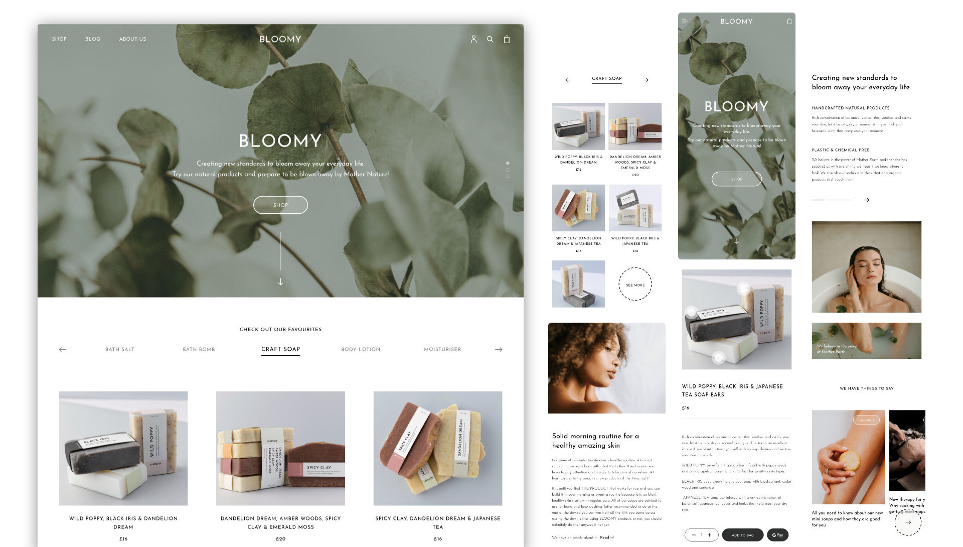
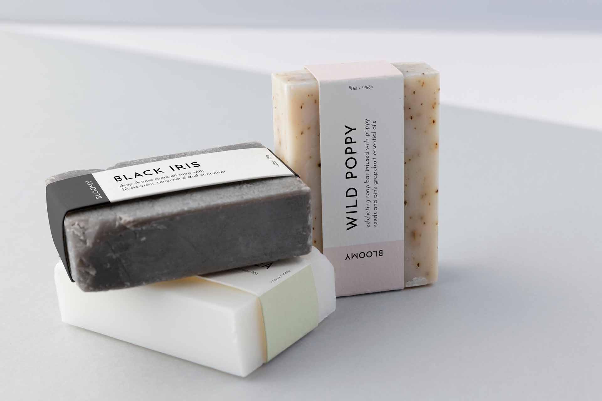
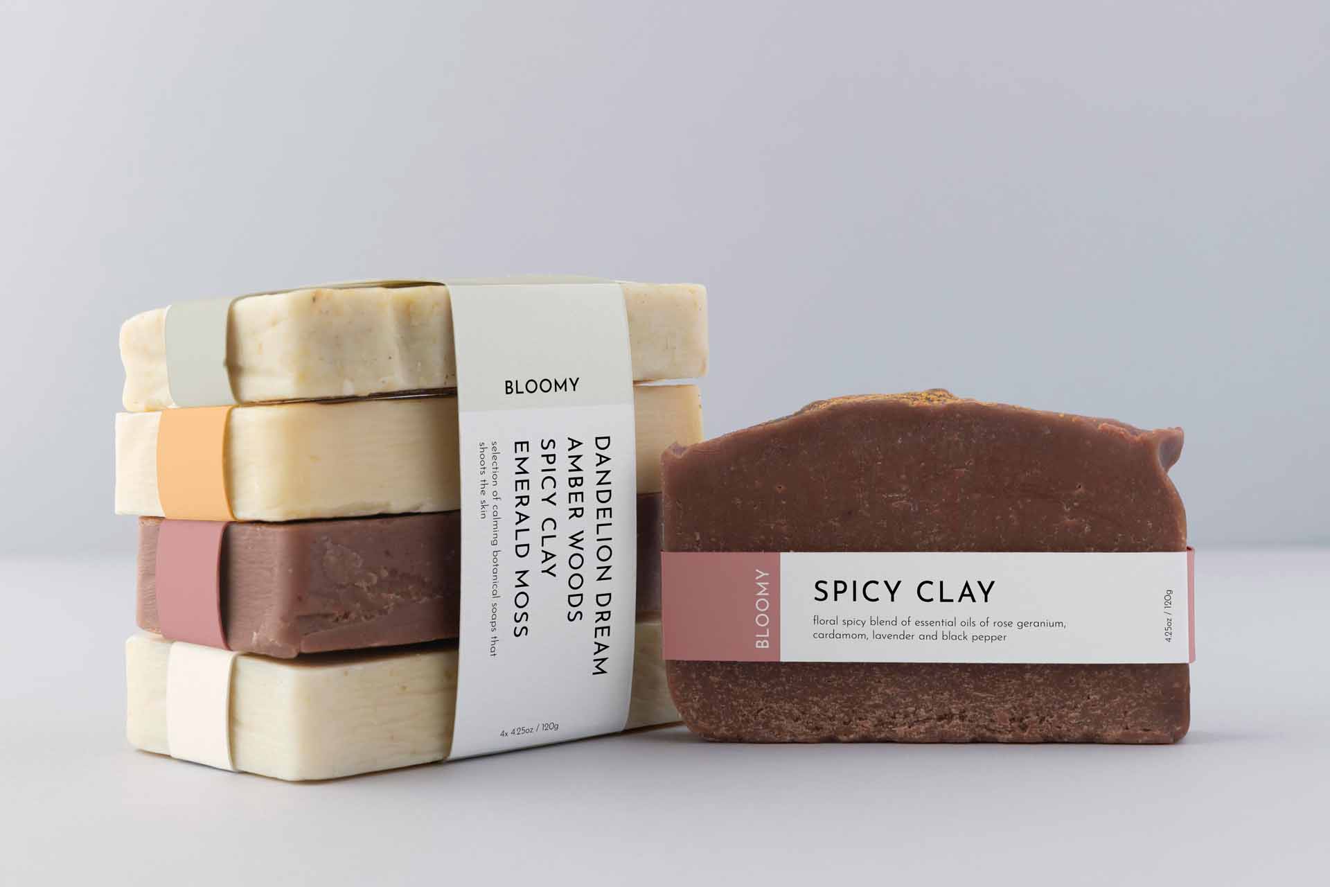
Packaging
Minimalist design & intriguing names
Just like the product itself, the packaging only includes the necessary information to make the shopping process easier. The abstract names help make the products more memorable, while the short description text shows the used ingredients and benefits. Each colour is connected to ingredients, feelings and state of mind, which is also intended to help with picking the right product.
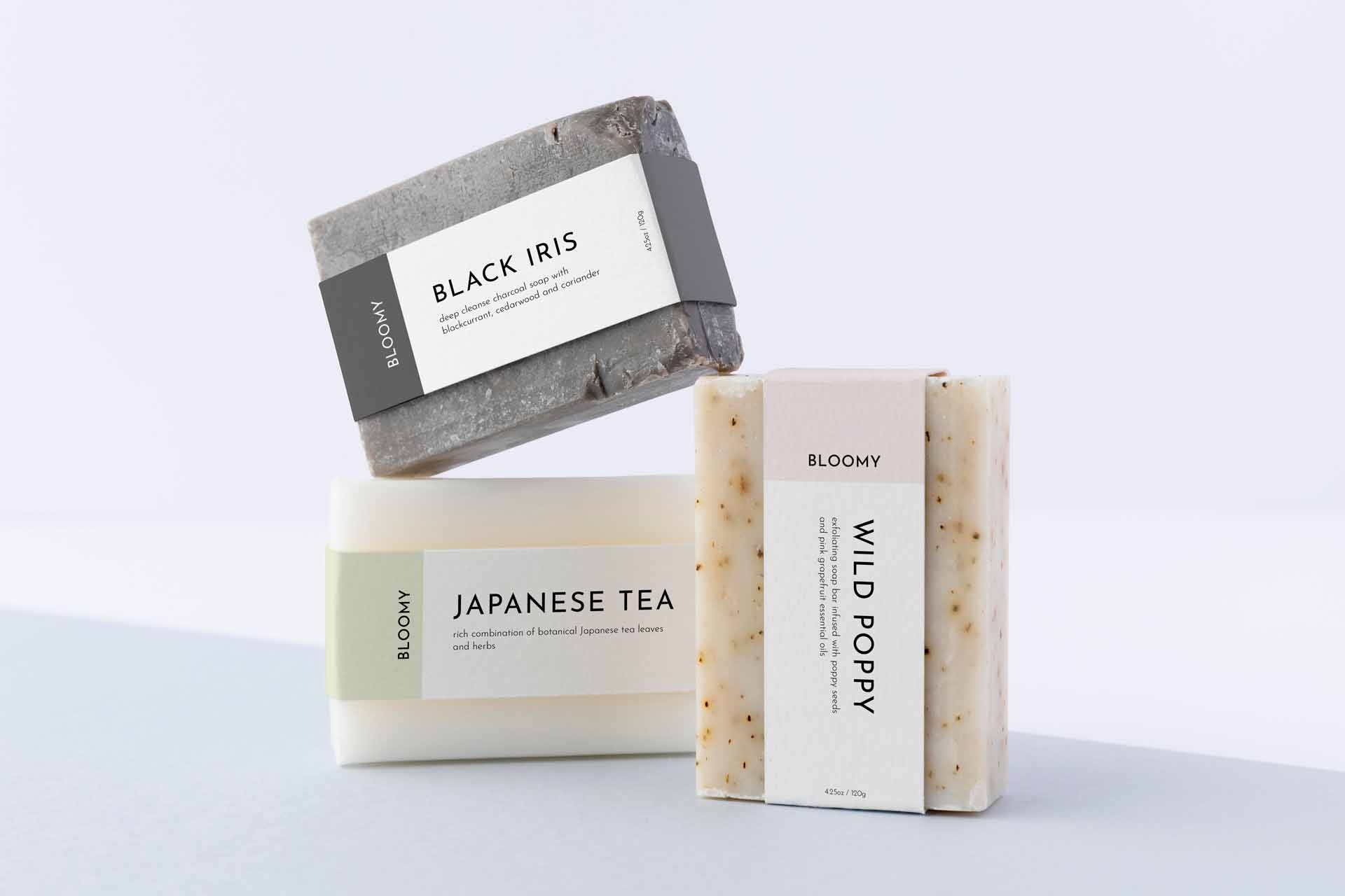
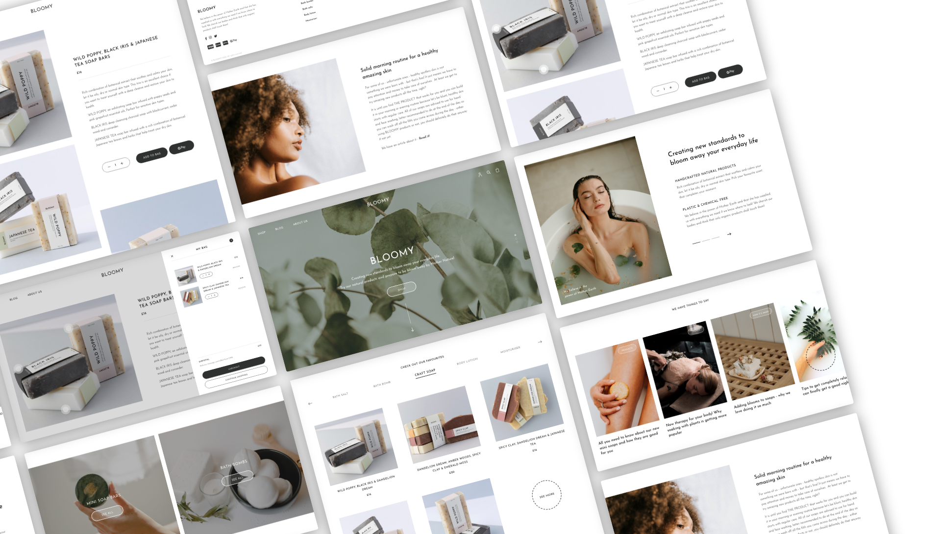
UI UX
Simple design with delicate interactions
Just like with the branding, the client wanted a website that shifts all the focus to the product and talks about benefits, ingredients and health-conscious choices.
The website is highly image-driven which provides a nice contrast to the clean, simple design. The image gallery includes product-focused shots, nature-related images and shots of the target audience enjoying the products.
For all of the products, there is a section dedicated to skincare routine that explains how each product can be built into your day – based on what we learnt from our research it felt important to include this to show users how easy it is to use the products and what results they can get by using them.
We paid extra care to make sure the website is up to date with all the latest functionalities that make the user journey smooth and enjoyable, including the ‘Build your own morning ritual’ tool and purchasing with Google Pay.